Social-Media
The old web design of Facebook will disappear in September.

Facebook's "classic" experience, the gui to the famous blue navigation bar at the top, disappears for good in September. Engadget notes that a Facebook help page has been revamped to indicate that everyone will soon have a new version. While you can briefly turn back to the old interface on the Facebook homepage, the button warns that "the classic Facebook will no longer be available as of September."
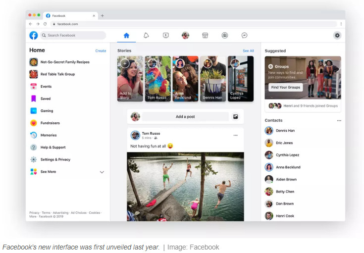
The new design was revealed at the Facebook developer conference last year and initially rolled out to the iOS & Android apps market. In March, it was widely released on the web as an opt-in app, leaving users free to continue using the old version if they want to.
However, the old version will vanish for good by September.
The new interface is a big improvement from what Facebook has used for much of its life. It's a lot smoother, it has a lot of white space, and there's even a dark mode for people who are into that kind of stuff. Functionally, it also focuses primarily on the functionality of the Services Groups, as well as prominently featuring links to the Watch, Marketplace, and Gaming pages of Facebook in its top navigation bar.
It's a much-needed update compared to the cluttered look of the past, but it's hard to see it bring back any Facebook users who have abandoned the service in recent years.
